Are you wondering what the logo of Konligo means and how the team came to this final design? Well, we have asked two of the founding members, Niels De Temmerman and Aushim Koumar, to give a bit more explanation about the logo. As you will read, the process that lead to the design was certainly not arbitrary.
Aushim & Niels, could you tell me how you started with the idea behind the logo.
Aushim: We wanted the logo to express the values and the story behind Konligo. As you may know by now, the central concept at Konligo is the connection.
Niels: And we saw that Konligo could implement that idea of connection on four different levels, from a product level to a meta-level.
-
- Our deployable structures all rely on their connections, enabling them to demonstrate their mesmerizing kinetic motion.
- These hinged connections give rise to unique shapes and fascinating transformations that invite people to interact, and thereby connect
- The arising spaces are built sustainably, following a circular approach to show our respect for and our connection with our planet.
- And finally, these shared core values, together with other humanistic values, drive and connect the team.
The name Konligo is therefore derived from kunligo, meaning “connection” in Esperanto.
Why did you choose for Esperanto?
Aushim: Esperanto was created by a Polish ophthalmologist named L.L. Zamenhof in 1887 as a culturally-neutral international language. For Zamenhof, such a language was important for promoting the peaceful co-existence of different people and cultures and thus for furthering humanism. In other words, a universal language to connect people.
So I understand how the connection is important for you. But how did you translate this in the logo?
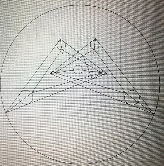
Niels: Well if you look at the logo, you can distinguish two triangles that are connected in a central point, as if it were a hinge of our scissor elements. We chose for triangles because they represent a very stable shape in mechanics and engineering. The connection in the middle represents the four levels of connection explained earlier.
Aushim: Together with a branding agency, we decided to remove the central connection and soften the edges, but the principle stayed the same.
I heard there was more than only triangles in the logo. Something about the golden ratio.
Niels: Indeed a very important aspect for us was to put even more meaning in our logo by hiding the golden ratio into it. The golden ratio Phi being not only a sign of beauty in mathematics and geometry, but also a sign of harmony and connection in nature, we included this form of proportion in our logo. The ratios of the distances between the center of all the circles in our logo are therefore all equal to a multiple of the golden ratio (see lines in figure 1).

Figure 1: The origin of our Konligo logo, with two triangles – representing the stability of our structures – connected in the middle to symbolize the connection and the hinges of our scissor structures. All the ratio of the distances are equal to a multiple of the golden ratio phi = (1 + sqrt(5))/2 or 1.618

Figure 2: The final logo, derived from Figure 1